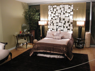
A few weekends ago, Alex and I were invited by my best friend Kim to attend a benefit for Colon Cancer research in Chicago. The event was called "Design for a Cure" and showcased various apartments and condos in a very cool building in downtown Chicago. Each space was created by a different designer using each of the Earth Elements. Below are my favorite (Fire) and Alex's favorite (Wood). (Notice my favorite has way more pictures.) It was a wonderful event for an amazing cause!
This room had me at hello. I love color, especially when it is played off cool textures and prints like the zebra on the bench and the red silk clover chair (which I covet!) And check out that view! Not bad.
You know I'm a sucker for blending the traditional with the modern...so these wingback chairs and traditional chest juxtaposed with the modern art and accessories were right up my alley!
This apartment was actually a studio so that bed is a Murphy bed! You'd never know!
This room was very unique. I love the artwork and the warm tones of the furniture and walls. This room had to be roped off because the contents were so pricey!
Love the artwork behind the bed. Very cool.
peace.love.chandeliers.
The art of adding sparkle to everyday life.
Friday, October 1, 2010
Wednesday, September 15, 2010
Rustic Chic
Any one who knows me knows that I am anything but rustic. While I enjoy a nice day in the country, I'm more "sit on the porch" than "sit on a horse." I guess you could say, I'm a little bit country; which brings me to my entry today. Just because you don't live in a log cabin doesn't mean you can't bring a little of the outdoors inside. It actually is a really great way of adding texture and making your look more casual. It doesn't have to be all over. Little touches go a long way. So go on, throw an antler or two on your mantle. You'll be glad you did.
{Better Homes and Gardens}
{Magnolia Home}
{Country Living}
This Lexington leather/zebra would add that rustic touch to any space. The texture is perfect!
{Country Living}
{London Times}
{Via Full House Blog}
{Better Homes and Gardens}
{Magnolia Home}
{Country Living}
This Lexington leather/zebra would add that rustic touch to any space. The texture is perfect!
{Country Living}
{London Times}
{Via Full House Blog}
Friday, August 27, 2010
What I'm Loving for Fall
Hermes Blanket
The Hermes Blanket (sigh) is one of my all time favorite classics. They cost a small fortune but are (I'm sure) so worth it. A luxury worth it's weight in wool and cashmere. Can't wait to splurge on one for myself someday. Until then, I'll just wrap myself in my boring, non-designer blankets.
{Design Studio}
Eclectic-ness (is that a word?)
I think that Eclectic-ness is always in style. In the fall, though, it's so fun to play with the rich colors, fabrics and textures that the season brings. In this Miles Redd room, I love how he uses the high gloss, bold indigo blue with the camel upholstery. Such a lovely combination. The antique chairs beside the modern art is just so classically eclectic. He does an amazing job with the bookcases, too.
Menswear Inspired Fabrics
On the runway and now, on your chair! I love that this rather serious Ralph Lauren-esque fabric is juxtaposed with the fire engine red. Makes it fun.
{Artichoke Designs}
Deep Purple
Let me go on record as saying that I usually loathe purple. Hate it. I have to say, though, lately, in small doses, it has been growing on me. Like in this lovely dining room, it is very rich. It's not going to be showing up in my house anytime soon, but never say never.
{Decorpad}
Sumptous Fabrics
Velvet can, at times, come off a little, shall we say...Elvis-y? But when you use it as an accent, especially with an on-trend color like this rich turquoise, it adds amazing texture.
{Country Living}
Friday, August 13, 2010
Going Wild: Zebra Rugs
{Elle Decor}
I just recently decided that my living room looks too much like my mother's. I love my mother and her house, but I'm thinking I need to young up my space a little so I went crazy and got a zebra rug. I love it but am having the hardest time incorporating it. I know what you're thinking, aren't you a designer? Shouldn't you be able to do this? Let me tell you something, designing someone else's space and designing your own space are two totally different animals. Thus, I am now searching the net for some inspiration and I think I've found some great ideas.
{House of Turquoise}
Everyone knows how much I adore turquoise and all shades of blue. Look how striking the rug looks against the bright color! It's so chic.
{Photo by Jose Picayo}
This is interesting. The moldings in this home look very traditional, so the designer has incorporated more traditional wing back chairs with the spunky zebra rug, low slung, modern sofa and oversized mirrored framed mirror. I always love the juxtaposition of the new and the modern.
{via Decorpad}
The chartreuse and navy accent pillows are unexpected and fun.
{photo via Apartment Therapy}
I love how fresh and clean this room is. The rug really pops.
Happy (my birthday) weekend...
Thursday, August 5, 2010
Hot (Haute?) Rooms
As someone who combs the internet and magazines for the freshest and most unique designs, I am always floored by the amount of creativity out there! It's SO inspiring. The designers out there right now are nothing short of genius. Here's a collection of some of my faves.
Breakfast area designed by the one and only Kelly Wearstler. I'm always impressed by Kelly's mixtures of styles. The antique French chairs with the modern art is truly inspiring.
Designer Todd Klein is SO talented. This room is so refreshingly modern but it's not stuck up. Love that in a room!
{House Beautiful}
I actually have this picture hanging on my inspiration board in my office. Chocolate brown is SO versatile! The bright turquoise really brightens it. And how cool is that bulletin board?!?!
{Beach House Decor}
I am SUCH a houndstooth girl. Thanks to Coco Chanel, it's classic and will always be in style. It is so chic in classic black and white but I also love it in bright colors like this lovely turquoise.
{At Home Arkansas}
Loving the juxtaposition of the sweet pink with the chic zebra print.
{House Beautiful}
Saturday, July 31, 2010
Captivating Coral
Lately I've been so attracted to coral. It's the perfect mix of pink and orange and can be beautiful in many different styles of homes. Stick a coral pillow on a neutral chair or sofa and see how it transforms it from blah to brilliant!
How FUN is this?!?! OMG I love it! Black and white looks fabulous with pretty much anything but I must say, coral definitely brings the WOW factor.
{Miles Redd}
This photo is taken right out of the Williams Sonoma home catalog and it's marvelous. Modern, yet livable.
What can I say, it's Martha. Say what you want about her, the woman's good. The bright coral wainscoting on the back of this chest is so unexpected yet still soft and beautiful.
{Martha Stewart Living}
What a wonderful twist on the classic beach house. The beige and white Roman shade looks so tailored and the coral adds that much needed punch.
{Nancy Taylor Lynch}
Love the gray and coral! The tones in the gray really soften the brightness of the coral and the overall effect is very cool.
{Ideal Home}
Thursday, July 29, 2010
Life's a Beach
After spending a week in breezy, no humidity Michigan, I am feeling a little claustrophobic in this landlocked state. It's so refreshing to see such beautiful beach homes! Kick off your shoes and enjoy...
Beautiful, modern, blissful.
{Simple Home Decorating}
Love this Hamptons Beach Home.
{Elle Decor}
This shell mirror is to die for!!
{Country Living}
Having even just one piece of the Long Cove collection by Lexington will bring that much needed beachy feel to any home.
Of course I adore the Chinese Chippendale Chair. It adds a classic element while still remaining appropriate in a beach setting.
{Home Decor Site}
XO
Beautiful, modern, blissful.
{Simple Home Decorating}
Love this Hamptons Beach Home.
{Elle Decor}
This shell mirror is to die for!!
{Country Living}
Having even just one piece of the Long Cove collection by Lexington will bring that much needed beachy feel to any home.
Of course I adore the Chinese Chippendale Chair. It adds a classic element while still remaining appropriate in a beach setting.
{Home Decor Site}
XO
Subscribe to:
Posts (Atom)